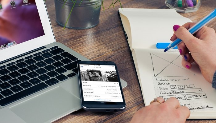
App makers literally start at a drawing board before moving on to the software development stage. The platform you’re using or intending to develop is actually just a collection of pages that flow from one to the next, minus all the digital frameworks that come with any mobile app.
App prototyping is the process of laying out or planning the layout of your app as well as how your future users are likely to interact with it. It’s a lengthy process that combines parts of UX (user experience) testing and design, as well as consumer or user workshopping.
The customer experience (UX) and user interface (UI) of your mobile app, according to Melbourne app designer DreamWalk studios, can effectively’make or break’ your end product. Seasoned app developers and development organisations all over the world urge digital entrepreneurs and budding software developers not to rush their app design prototyping because doing so may cause your app’s release date to be pushed back even more.
Given the various components that make up the process of app prototyping, it might be difficult to identify the stages of your prototype development, as well as to decide when an app has received sufficient prototyping. Engaging with the theories behind the various phases of app prototyping, on the other hand, may aid in exposing all of the dark corners of this very experimental activity. If you want to learn more about the different facets of app design prototyping, keep on reading!
App prototyping and UX/UI design
If you’re familiar with principles of UX design, aspects of app design prototyping may already be second nature to you. This is because a large part of prototyping your app will involve evaluating and reevaluating the user interface to ensure that it is as user-friendly as feasible. Making sure your app’s UI is good from the start will automatically reduce the amount of time you’ll have to spend making updates when it’s released, and also ensuring that your app is enjoyable to use right away.
When it comes to app design prototyping, experienced UX designers will likely employ a variety of methods to test their app, with app beta testing (or testing your app in the wild) usually being the final step in this lengthy process. A/B testing is one of the most outwardly simple but internally complicated tests you may conduct throughout your app design prototyping.
A/B test is a testing for identifying which line of action is most effective or pleasing to your app’s users by comparing two or more opposing variables. In essence, using this strategy for app testing will allow you to fine-tune the design and layout of your app. A/B testing does not always require testers to choose between two options (A or B), but it can also include a variety of options, allowing app developers to conduct A/B testing at any phase of the app design prototyping process.
Paper vs. digital prototyping
Many of us imagine designers organising a stack of sticky notes into flowcharts to lay out your app’s user journey when we think of “app prototyping” or even “UI design.” While paper or physical prototyping (also known as low fidelity prototyping) might be a useful method of prototyping for apps with fewer than ten pages, it can be difficult to use for more intricate user interfaces.
In the same way as ‘Choose Your Own Adventure’ books are non-linear, most user interfaces are, but wherever you end up is inexorably tied to what brought you there. Because a rising number of app layouts aren’t linear, they can be difficult to map out, especially if your app has a lot of different interactive user pages with a lot of varied options for users to choose from.
So, how do you map out apps that are far too huge and dynamic for sticky note UX mapping to be effective? This is where digital prototyping (also known as high fidelity prototyping) comes in. You can use digital prototyping to keep track of pages that link to one another without having to maintain an open flow or swipe-through design. High fidelity prototyping can be done at any point throughout the development of your app, while most independent developers choose to switch from low to high fidelity prototyping as they go through the prototyping process.
The best digital tools for app prototyping
If you’re a digital entrepreneur or a budding software developer with a big app concept, chances are you’ll be seeking for some reliable digital tools to assist you get through the final stages of development.
Rather than static pages, the last phase of your app’s development will need you to employ ‘clickable’ mockups for all of your app’s pages. It’s also worth double-checking that your app’s layout matches your app design prototype by going through app pages. Prior to beta testing, you don’t want to make the mistake of assuming that everything is in order or that everything will perform as expected.
Many mobile prototypers, such as Pidoco and UXPin, can allow you to create clickable prototypes for independent app testing prior to your beta launch. After your clickable prototypes have been developed and tested, you can use services like Protoshare and Userbrain to share your app with a larger audience and gain further feedback from fellow software developers and expert UX designers.
Finally, it’s important to keep in mind that launching an app is always going to be a nerve-wracking experience, especially after months of app design prototyping. In fact, every extra month spent on your app’s development is likely to make the day of its debut feel exponentially more terrifying. However, there’s no doubting that investing in app design prototyping will ensure that your final product is as robust as possible when your app’s release date comes.


